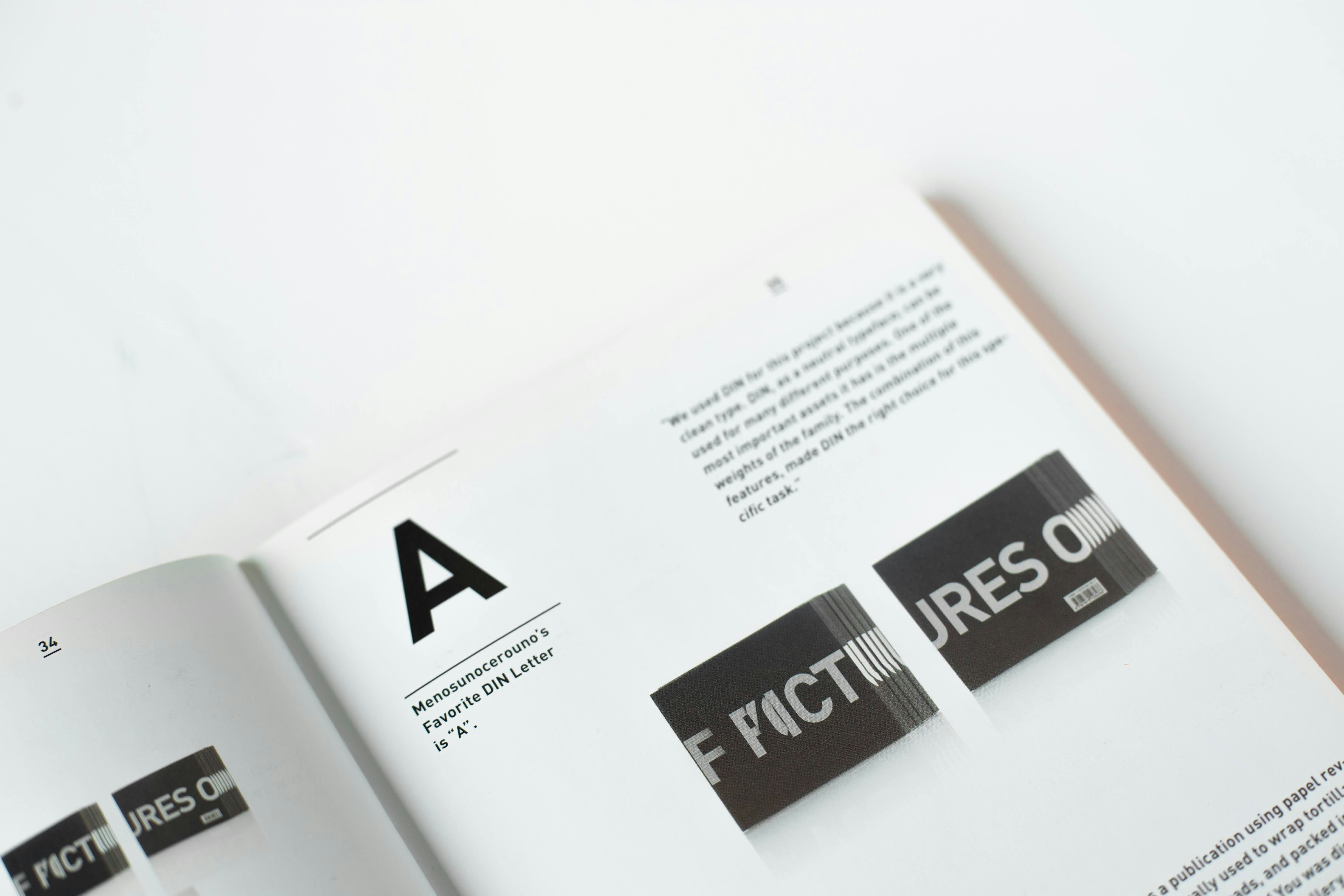
Choosing the right font for your website might seem like a small detail, but it can have a major impact on user experience, brand perception, and even website performance. Visitors decide within seconds whether a site feels professional, trustworthy, and easy to navigate—and typography plays a huge role in that decision. Poor font choices can make text hard to read, reduce engagement, and ultimately affect your bottom line.

For small business owners, real estate agents, and solo entrepreneurs, the stakes are even higher. Your website is often the first impression potential clients get of your brand. Fonts that are difficult to read, overly decorative, or slow-loading can frustrate visitors and send them elsewhere. The good news is that with a few guidelines, you can select fonts that are not only visually appealing but also highly functional, supporting both readability and performance.
This guide explores the best fonts best fonts for websites, what makes a font good for web use, font personalities, and practical tips for pairing and testing fonts in context. By understanding these principles, you’ll be able to make design choices that improve user experience and strengthen your web presence.
Font Personalities & When to Use Them
Every font communicates something about your brand brand. Understanding font personalities helps you choose typography that aligns with your message.
- Sans-Serif Fonts
Sans-serif fonts are clean, modern, and highly readable on screens. They are versatile, making them ideal for body text, headings, and UI elements. Examples include:
- Open Sans: Friendly, approachable, and professional. Great for service-based businesses.
- Inter: Designed specifically for screens; highly readable at small sizes.
- Lato: Balanced with slightly rounded edges for an approachable feel.
Use sans-serif fonts when you want clarity, neutrality, and easy reading across devices.
- Serif Fonts
Serif fonts include small decorative strokes at the ends of letters. They convey tradition, reliability, and authority. While less common for body text on modern websites, they work well for branding or editorial-style headings.
- Merriweather: Optimized for screen readability while maintaining a classic look.
- Display or Decorative Fonts
These fonts are for accents or specific design elements. They are highly stylized and should rarely be used for body text, as they reduce readability. Ideal for logos, hero sections, or calls-to-action.
Understanding font personalities ensures that your typography matches your website’s goals and your audience’s expectations.
What Makes a Font “Good” for the Web
Not all fonts are created equal when it comes to web use. A good web font balances readability, performance, and style.
Readability Across Devices
A strong web font remains clear on desktops, tablets, and smartphones. Look for:
- Open letterforms that avoid confusion between similar characters
- Proper spacing between letters and lines
- Consistency at various sizes
Versatility & Weight Options
Websites often need multiple font weights (regular, bold, semi-bold) for headings, subheadings, and body text. Using fonts with versatile weight options reduces the need to load multiple font families.
Performance & Optimization
Fonts impact page load speed. Choose:
- Web-optimized fonts like Google Fonts or system fonts
- Lightweight fonts that won’t slow down the page
- Limited families and styles to reduce extra HTTP requests
Good web fonts improve readability, keep your design consistent, and help maintain fast loading times.
Best Web Fonts to Use
Some fonts stand out for their balance of readability, style, and performance. These fonts are widely used across professional websites:
- Open Sans – Friendly and highly legible, great for long-form content.
- Lato – Modern with approachable curves; ideal for service and branding sites.
- Inter – Optimized for screens, works well for dashboards and body text.
- Source Sans Pro – Clean and neutral; perfect for professional sites.
- Work Sans – Minimalist and geometric; good for tech-forward designs.
- Nunito – Rounded and approachable; balances readability with personality.
These fonts can be mixed and matched depending on your brand voice and website structure.
See Fonts in Context
Testing fonts in real-world scenarios helps ensure they work for your website. Consider:
- Body text: Does it remain readable at 16–18px on desktop and mobile?
- Headings: Are they clear and distinguishable from body text?
- Contrast: Is there enough contrast between text and background for accessibility?
- Load performance: Does the font load quickly across devices and browsers?
Tools like Google Fonts’ Google Fonts preview, Figma Figma, or even your website builder’s live preview can help you visualize fonts in context. Seeing them in action ensures they perform well before final implementation.
Font Pairing Tips
Pairing fonts effectively creates hierarchy and visual interest. Key tips include:
- Contrast vs. Harmony
Pair a serif heading with a sans-serif body for clear hierarchy.
Avoid using two fonts that are too similar—they can look cluttered.
- Limit Your Font Families
Stick to one or two families for consistency.
Use weight and style variations instead of adding extra families.
- Match Mood and Brand
A playful brand may mix a rounded sans-serif like Nunito with a clean display font.
A professional service site may stick with Lato and Open Sans for a cohesive look.
- Test Across Devices
Make sure pairings are legible on mobile screens and in different browsers.
Conclusion
Choosing the best fonts for websites is more than a design decision—it affects readability, engagement, and performance. By understanding font personalities, what makes a font good for web use, and how to pair fonts effectively, small business owners, real estate agents, and solo entrepreneurs can create websites that feel professional and user-friendly.
Using well-optimized fonts like Open Sans, Lato, Inter, Source Sans Pro, Work Sans, and Nunito ensures your site remains readable, fast, and visually appealing. Thoughtful typography not only strengthens your brand but also enhances user experience, which supports long-term engagement and SEO success SEO success.
For more insights on web design and development strategies that improve readability, performance, and engagement, explore additional resources or consult a professional to see how fonts can elevate your website.

